
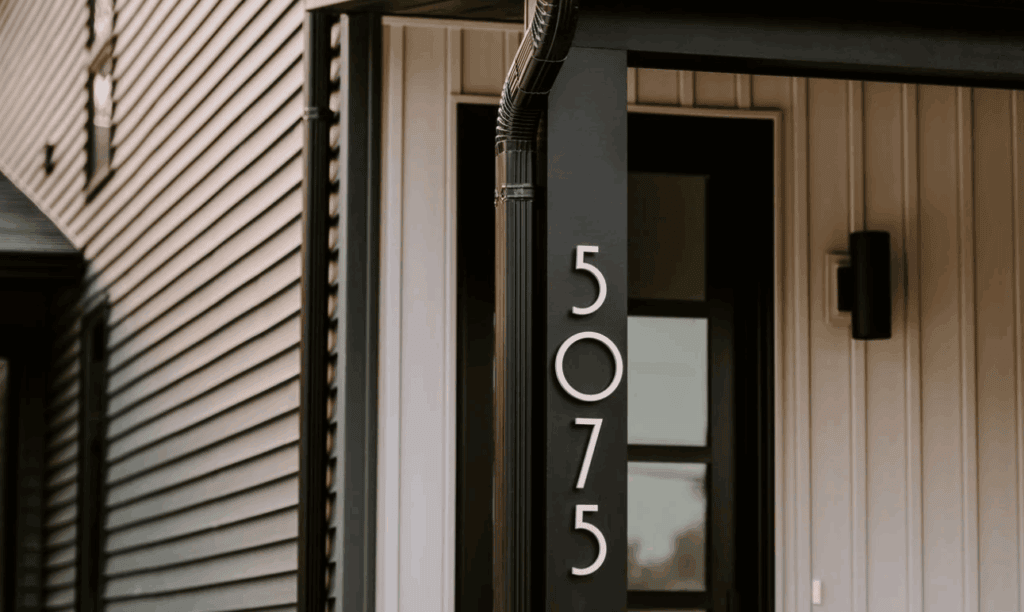
House numbers do more than tell visitors where to find you. They’re a subtle way to inject personality and style into your home’s exterior. But figuring out the perfect spot for them isn’t always as simple as it seems. With the right placement tips, you can combine functionality with style, making sure your fixture is easy to see while complementing your home’s architecture. Every detail counts when it comes to creating a home that reflects your taste, and even something this small can make a big difference.
Apart from their functional role, stylish outdoor house number signs play a big role in how your home looks. They add a finishing touch that ties everything together. When the design, font, and material complement your house’s exterior, it creates a more cohesive and intentional look.
Clean metal finishes suit a contemporary façade, while softer tones or classic shapes can work beautifully with traditional homes. It’s a small detail, but one that people notice more than you’d expect. At the same time, you don’t want to sacrifice visibility for aesthetics. The goal is to strike a balance between looking good and being easy to read from the street.
Style of Your Home
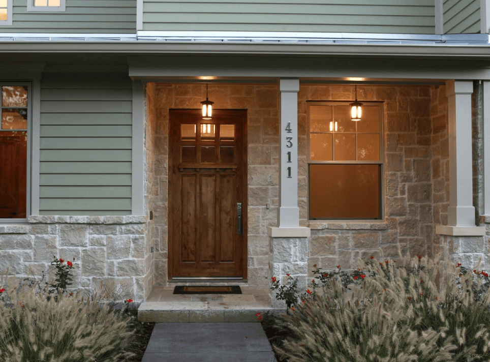
When choosing home number signs, most people naturally lean toward matching them with the overall style of their house. While that’s always a safe option, it’s not the only approach. You can also use them to express your personal taste, even if it contrasts slightly with the exterior. For example, pairing a clean, modern font with a more traditional façade can create a subtle, interesting mix that still feels intentional.
Contrasting Finish
Another key detail to think about is contrast. If the finish blends too closely with the background, it can be hard to read from a distance. Choose a colour or material that stands out, like black against a light wall or brushed metal against darker tones. Not only does this improve visibility for deliveries and guests, but it also adds a sharper, more defined look to your exterior. When you strike the right balance between style and contrast, even this small detail can elevate your home’s overall appearance.
Add Illumination
Making sure your address is easy to spot at any time of day is just as important as how it looks. A simple way to do this is by placing it near an outdoor light source so it remains visible after dark. Whether it’s positioned close to your entryway lighting or highlighted with a small landscape fixture, that extra bit of illumination can make a big difference for guests, deliveries, and even emergency services.
Go Oversized
Size also plays a big role when choosing outdoor house number signs. If your house sits further back from the street, smaller digits can quickly disappear. Going larger not only improves visibility but can also become a design feature. Bold, oversized options tend to feel more intentional, especially when placed on a spacious exterior wall. This practical choice can also enhance the overall look of your home without feeling overdone.
Above the Front Door
If you have a bit of open space above your front door, in the form of a beam or a transom, it’s a great spot to place your address. This area naturally draws the eye, so it can turn something functional into a subtle design feature. Whether you lean toward a clean modern look or something decorative, this placement here can enhance your entrance.
Serif Font
Do Serif font door numbers look good? Numbers in serif fonts bring a more classic, timeless feel that works beautifully even on newer homes. They add a sense of character, don’t feel overdone and tend to blend nicely with landscaping and traditional elements. When done right, this combination of placement and style can make your exterior feel more polished, while still reflecting your personal taste.
Use a Plaque
If you’re looking for a simple way to make your address stand out, mounting it on a plaque can make a big impact. Instead of placing numbers directly onto your wall, adding a backing creates a more defined and intentional look. Materials like metal or wood can bring in extra texture and contrast, helping the design feel more complete.
Use a Planter
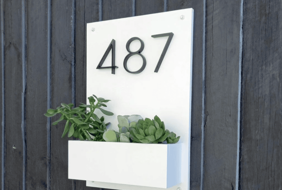
Another approach that feels a bit more creative is incorporating your address into a planter. This works especially well if your home sits further back from the street, as it brings visibility closer to the roadside. It also adds a bit of personality. When done thoughtfully, it can feel like part of your landscaping rather than just an add-on.
For this idea to work well, scale matters. The planter and the numbers need to be large enough to be seen clearly from a distance, the effect gets lost. It also helps to tie everything together by choosing plants that match the rest of your outdoor space. When the design feels consistent, the setup looks more polished and intentional, rather than separate elements competing for attention.
Floating Numbers
You don’t have to mount your address flat against the wall to make it look good. A floating style can create a much more modern and refined effect, giving the numbers a bit of depth rather than blending into the surface. Because the hardware is hidden, the focus stays on the design itself, which makes everything feel cleaner and more intentional.
One of the nicest details with this approach is the soft shadow it creates behind each number. It’s subtle, but it adds just enough contrast to make the design stand out without being too bold. This kind of installation works especially well on simple exteriors where you want a sleek finish without adding extra elements.
Creating a Cohesive Look
Visibility and distance have a big impact on how your house numbers look. If your address can’t be spotted quickly from the street, even the nicest design won’t be doing its job, especially in situations where timing matters. If your home sits closer to the road, a more modest size can still work well, but the further back it is, the larger and clearer your numbers need to be. The goal is to make them one of the first details people notice without having to search for them. Font choice matters too, and simpler, cleaner styles tend to be easier to read while still fitting most exteriors.
It’s also worth thinking about durability. Since they’re exposed to the elements year-round, choose materials that can handle weather changes. This way, your design will look sharp over time. When you balance style, visibility, and durability, the result will be practical and well thought out.